Fusion Magazine

Zygote Press
Skedaddle
Apple Farm
Character Design
BAGGED: The Plastic Bag Museum
Bellora: Identity and Packaging Design
Twice Loved Teddy
Kitschoodle
Cleveland Botanical Garden Exhibit
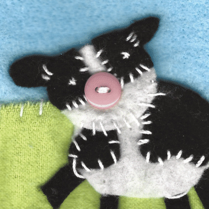
Typolibris Book Covers
Illustrations
is a graphic designer and illustrator, residing in northeast Ohio. Jocelyn was raised in over 5 states, giving her a unique, one of a kind perspective and a passion for finding ways to connect with different audiences.Her goal is to help clients stand out through bold typography, playful illustration, and creative marketing solutions that makes an impact.
I cannot wait to see what we make together!
I can't wait to hear what you have in mind! (∗´ര ᎑ ര`∗) Whether it be questions about a potential project or you would like to understand my work better, I am happy to answer any questions you may have!
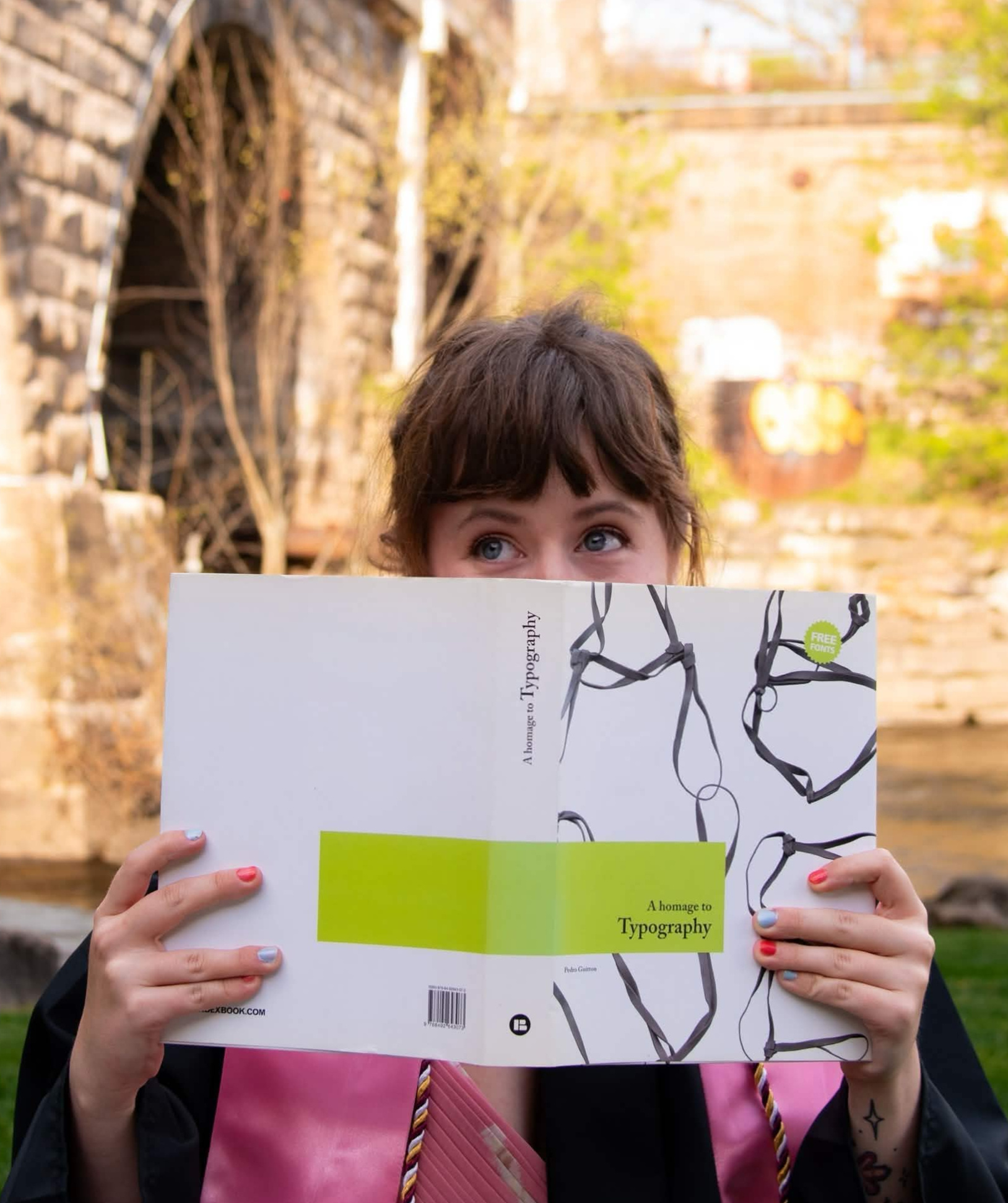
credit to Megan Porter for photograph
Hi! Hello! What's up?!
I am a graphic designer and illustrator with a drive and passion for creative thinking. I've developed a strong foundation in both creative problem-solving and visual communication, combining strategy with creativity to produce work that is both functional and memorable.My work, both digital and print, has been seen across countless Kent State magazines, particularly Fusion and A Mag. Currently, I am the social media intern at Zygote Press, a non-profit printmaking studio and art gallery in Cleveland.I thrive through experimentation and discovery. I am always looking for new and exciting ways to step outside of boxes while making sure each project reflects the unique vision behind it. Every blank canvas is an opportunity to create something fun and full of life.When I'm not working, I enjoy watching movies and crocheting! But I also dabble in video games. My favorite things in life are the beach, harbor seals, and adorable patterned clothing.
These are collections of sketches, full pieces, and other miscellaneous illustrations I have done. Some self explanatory, others considerably less.
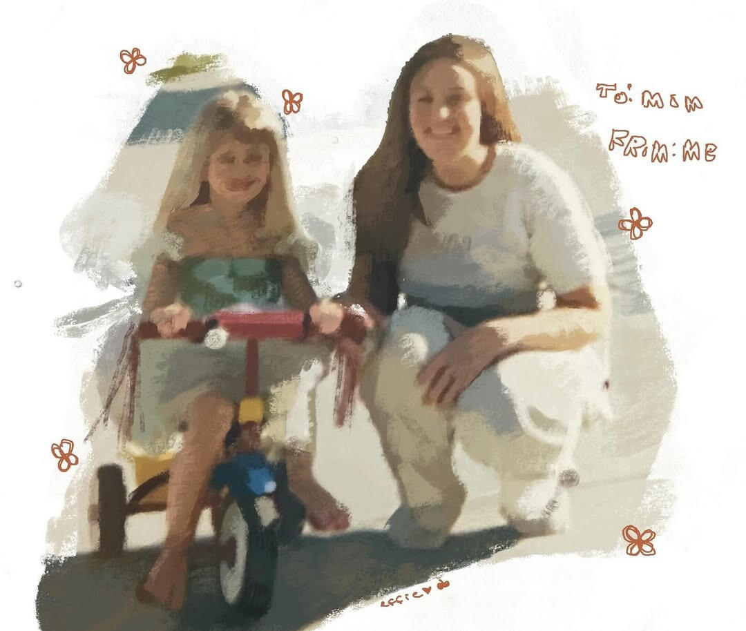
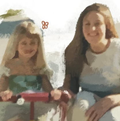
* For Mom
A digital paint study I completed for my mom based off a photo of us from many years ago.
I focused on creating natural paint textures through a digital pen. I attempted to create hatch markings similar to dry paint brushes. The way the paint trails off gives it the feeling of a memory.


* Little Pomme, the Tiny Apple
More paint studies of a character named Little Pomme. I created him with the sole purpose of being cute and small. He is the size of a polka dot, and his favorite pastime is surfboarding in puddles on a sewing button.
I wanted to use his study to experiment with colors and composition.
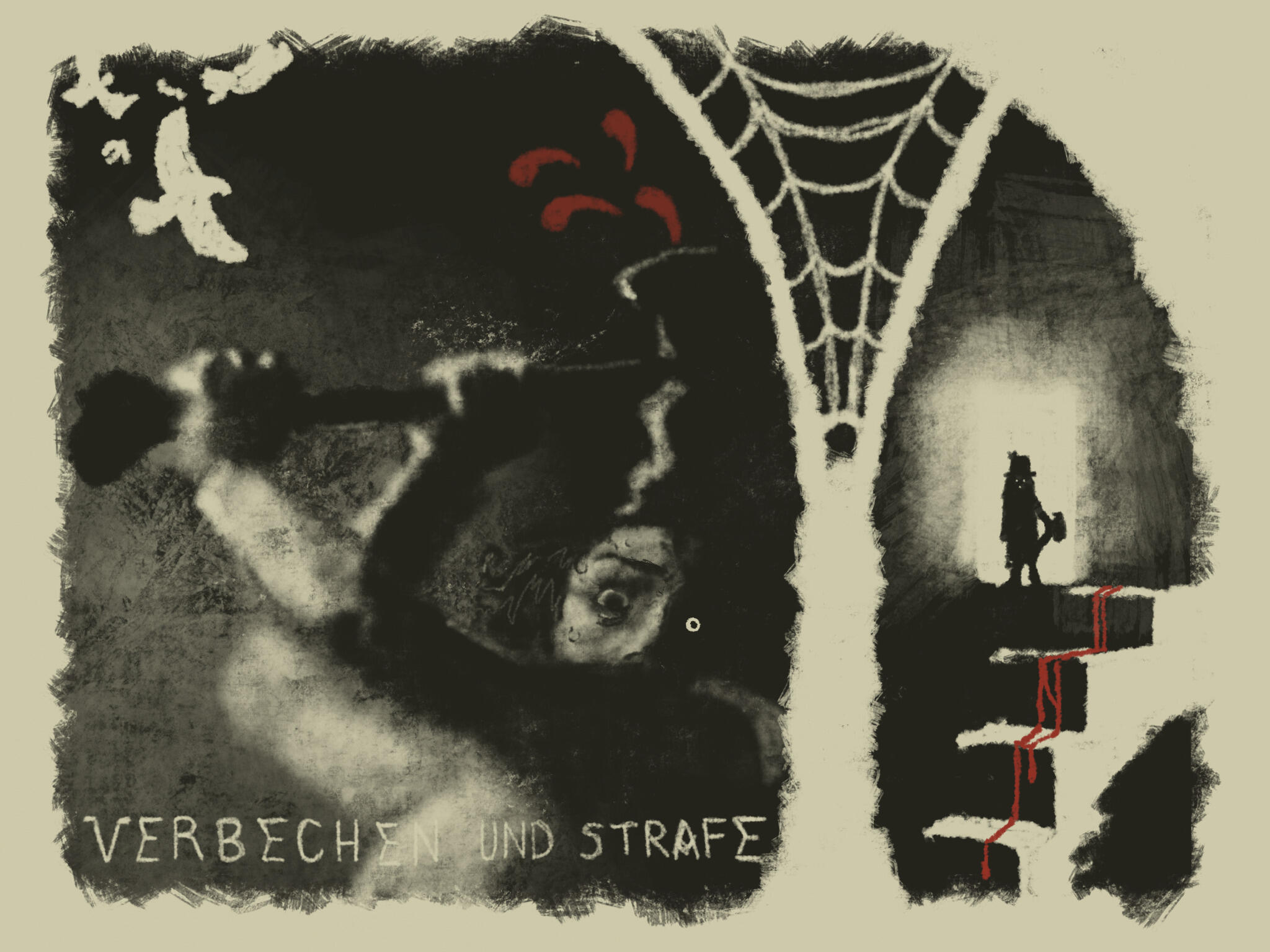
* Crime and Punishment
Originally done for a wonderful friend of mine during an annual Artfight event. They are interested in Russian literature, specifically Crime and Punishment and Rodion Raskolnikov's character. But, I thought doing just a simple poster in my style was a bit boring and on the nose. I wanted to really capture the dread and guilt.
So, I combined their love of Russian literature and German expressionist film together. I took inspiration from movie posters like the Cabinet of Dr. Caligari and other films at the time.


* Sketchbook Sketches (2025-2026)
A combination of digital and traditional sketches. Warm-ups and others.
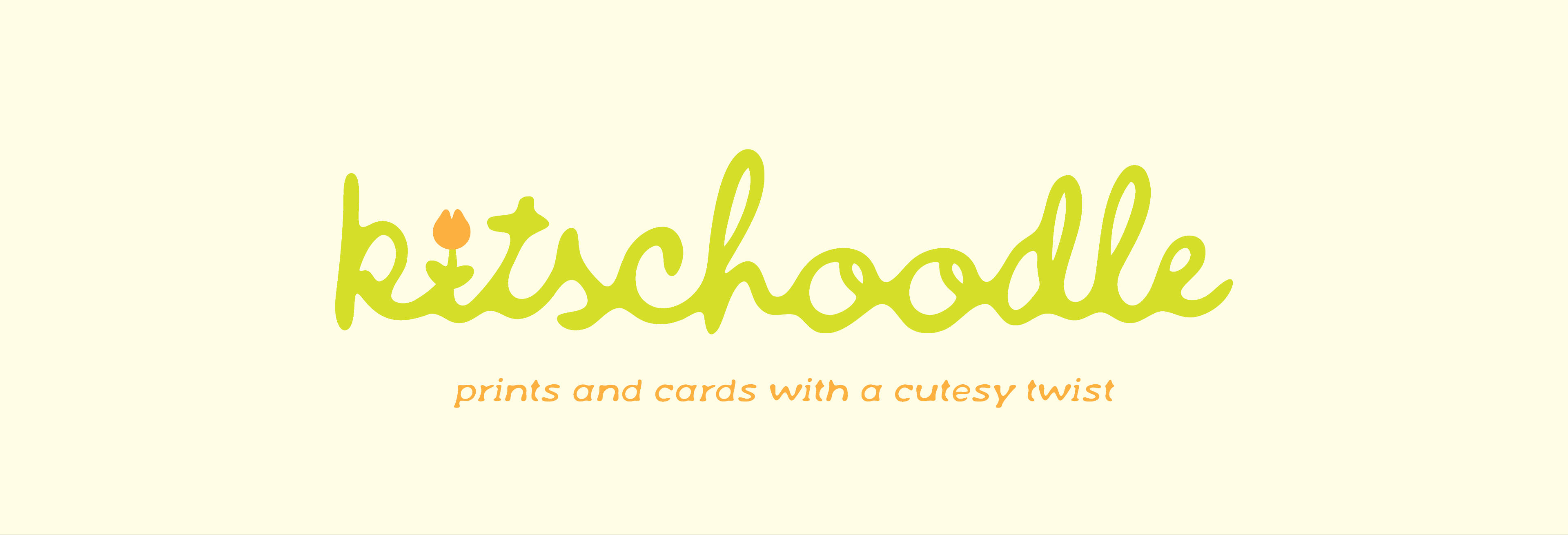
Kitschoodle is a personal Etsy business that focuses on the selling of hand illustrated vintage prints of modern culture (like video games, tv, movies, etc). It is prints, greeting cards, and stickers with a cutesy twist! The business also resells found vintage pieces to other collectors around the world.
* Logo
I created the logo with ink-blotty hand-written signatures in mind. "Kitsch," in my mind, is meant to be sickeningly sweet and cute. It's cartoon bunnies holding flowers, with big rosy cheeks. What is cuter than rounded lettering with a precious tulip to dot the "i?"The colors are more muted, as opposed to the very stereotypical bright pinks and turquoise. It is meant to set it apart from other kitsch-design centered businesses.


* Business Cards
The most important thing about marketing a business that is primarily online is business cards. The business cards were made with the possibility in mind that they would be tweaked for any other workers joining the team.
Zygote Press is an open door printmaking studio, gallery, archive, and education center that supports artists through residency programs, studio access, and artistic development in a collaborative environment open to all. During my time with them as a social media intern, I helped develop several content solutions through Instagram and Facebook.
* Instagram Insights


* Facebook Insights


* Insights information gathered from Early January 2026 to Early June 2026, since taking on the role of social media intern.


* Graphic Design / Content Creation
One of my ongoing tasks is to create graphics that go out daily throughout the week. My favorite moments working with Zygote are moments of total illustrative freedom. Our brand colors, red, white and black, are a staple. I enjoy amplifying them, and altering them in exciting ways! I also love putting literal paper in our posts to further push our printshop.I also do a lot of motion design!


* Photography / Content Creation
As the social media intern, I spend time at off site and on site events taking photos! I also do livestreaming for our Instagram. It is important to capture happy faces and moments, and let people who couldn't attend know that there are more events like this in the future through our copywriting.
This project was a group effort with designers John Jackson and Gianna Giocomelli. Our goal was to create a conceptual exhibition for Cleveland Botanical Gardens with a focus on children's interests through physical activity and education.
* Research and Sketching Process
Our group's work started with extensive research of both the Cleveland Botanical Gardens and children's museum activities. We went back and forth quite a bit with ideas and how to best execute them, mostly discussing ways to safetyproof our exhibit so children couldn't injure themselves with the moving parts.For our walls, we decided to create . . .
1. An interactive spider web, where children can create their own spider web by wrapping the string along a hexagonal peg board. On the string, there are wooden spider and bug charms so they can move across the string and effectively chase one another across it. (SPIDER CHASE)
2. Information cubes that are in the same style as playground tic-tac-toe boards. But, instead, have information about Ohio native flora. (FLOWER POWER)
3. A plain informational wall featuring a native Ohio fish, amphibian, and reptile. (AQUATIC MAYHEM)For our ideation, we focused a lot on famous children's illustrator and storyteller Eric Carle. Specifically, we looked at his ways of creating simple shapes and textures into cohesive illustrations.


* My Part — Illustrations and Final Design
For my part of the workload, I was tasked with . . .
- Copywriting and information on our main exhibit wall. Creating our titles and sentences introducing the information.
- Creating the bottom environmental textures of the wall.
- Helping John with painting our watercolor textures and scanning them in at 1200 DPI.
- Creating the visuals for the spider web wall. Including the wooden charms and set up of information and text.
- Creating visuals for the aquatic mayhem wall.
- Creating the leaf shapes that mimic Cleveland Botanical Gardens visual marketing throughout Hershey Children Gardens.I also created a mockup in order to show the size of the board. It stands around 4.5 feet tall, the average height of an 8 year old child. We wanted it to be eye-level with our demographic.
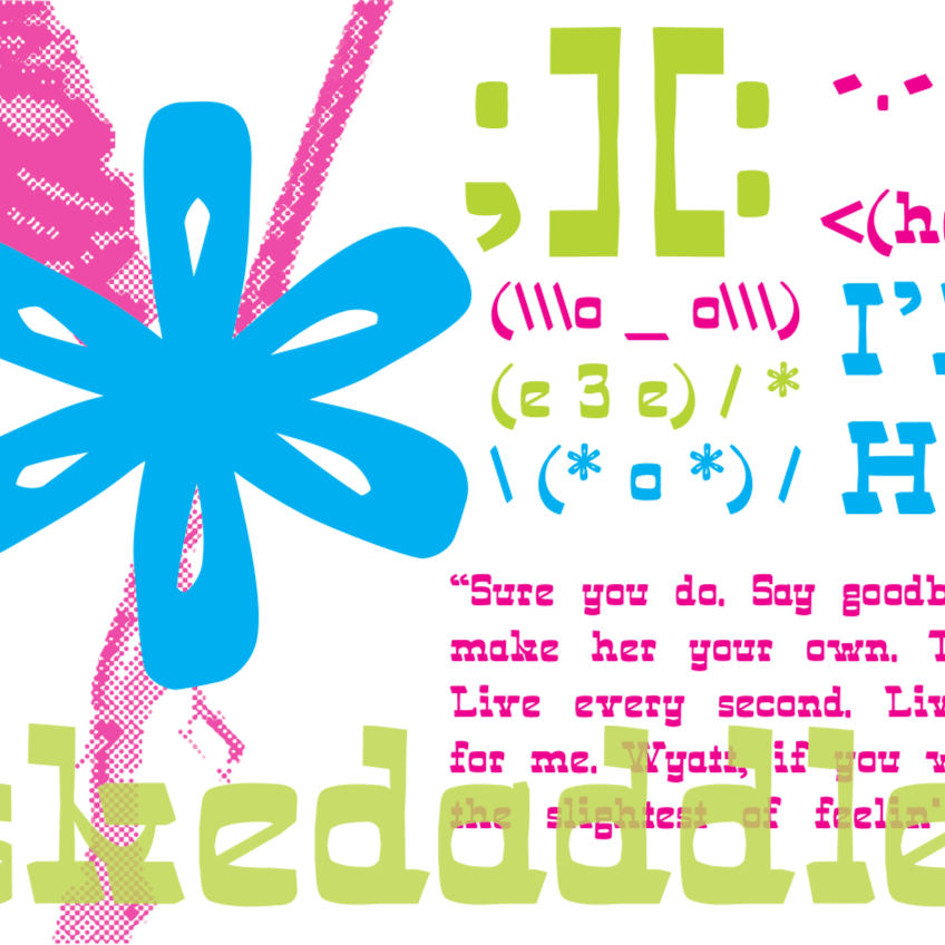
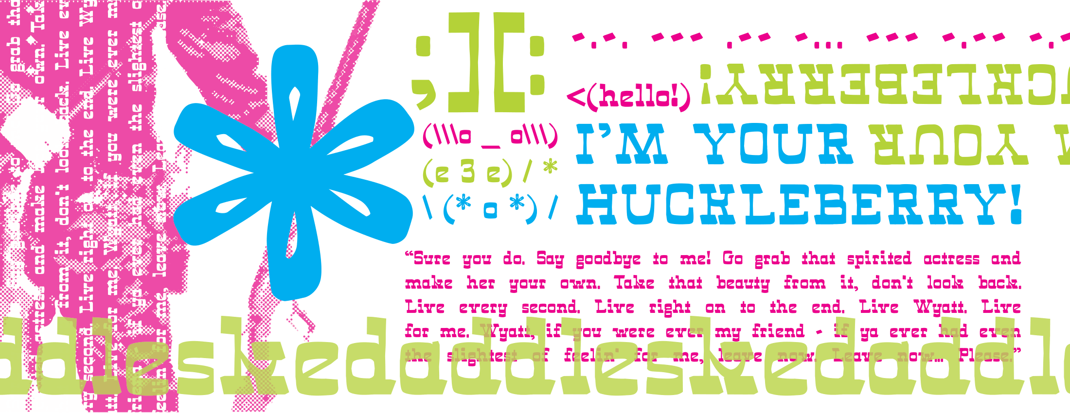
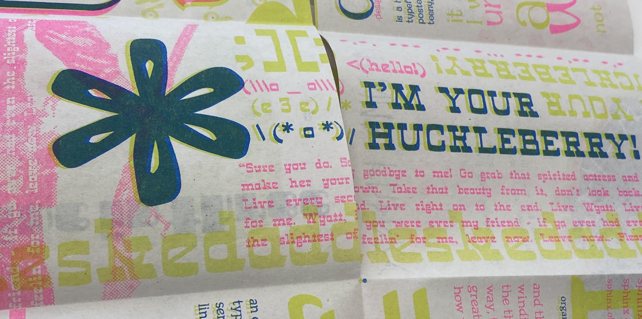
SKEDADDLE is a typeface created for a conceptual Western film festival. It is meant to look somewhat handwritten, bouncy, and playful. It works well as body type.
* Skedaddle Process
Skedaddle was born from a logo prototype called KANTIG, designed for a German expressionist film festival. Skedaddle is handmade for a conceptual Western film festival, meant to work as body type in adverts and marketing.It is defined by its handwritten feel, playful shapes, and creative solutions.
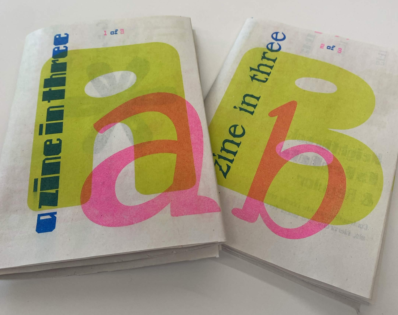
* Skedaddle Zine Piece
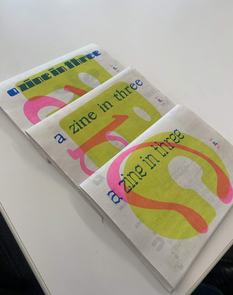
The typeface was featured in the Typeface Design Zine of Spring 2026. For this opportunity, I was able to display the typeface in a creative zine with my wonderful peers. The final product was printed in the Riso
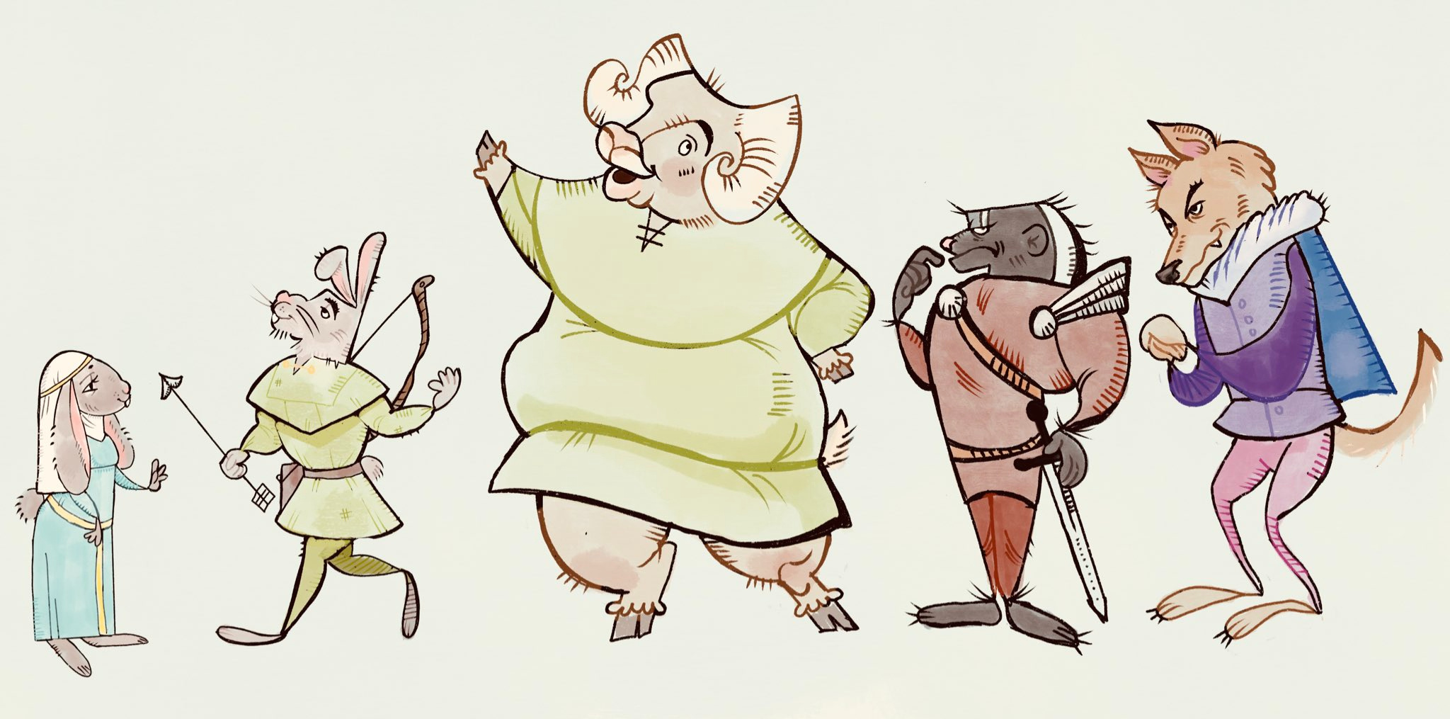
This illustration was done while in attendance at Kent State University's VCD 42006 Character Development: Animals and Environments course. During this time, I learned a lot about the importance silhouette in figures and visual storytelling.
* Robin Hood Character Design
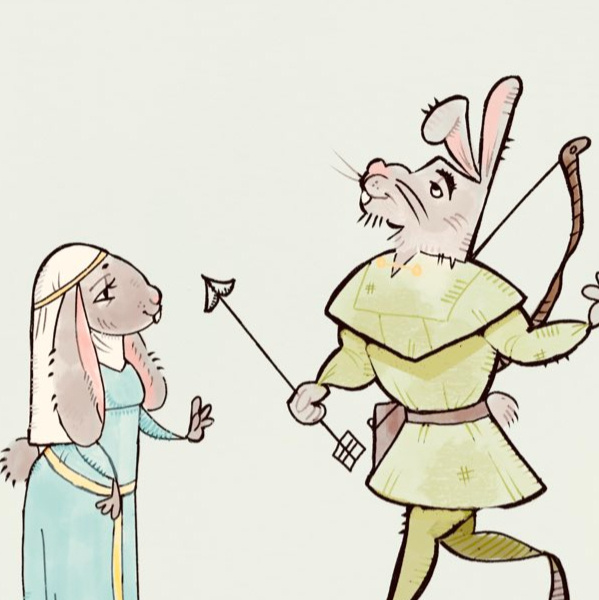
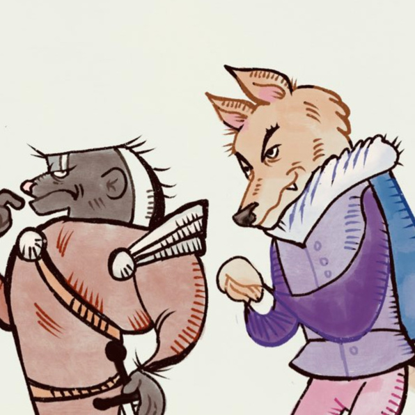
My primary goal with recreating the Robin Hood cast as cartoon animals was to capture the wood-carved 16th century manuscript look. A lot of my inspiration came from an encyclopedia of Byzantine and medieval art I had found at the thrift store. The hands are drawn in part inspiration from the animated movie The Secret of Kells.
In order to recreate the manuscript look, I focused a lot on creating hatched shading in order to create texture.
The Robin Hood crew is based off of western American animals, with Maid Marion and Robin Hood as jack rabbits, Big John as a bighorn sheep, the Sheriff of Nottingham as a honey badger, and King John as a wolf.
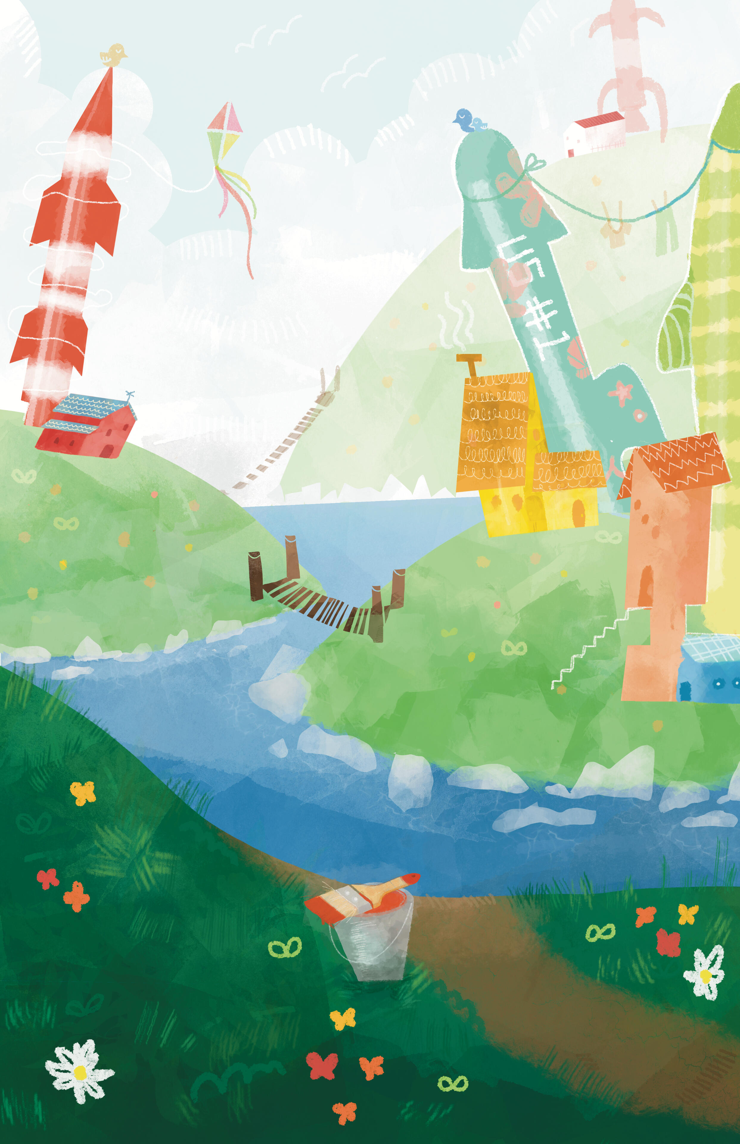
* Alert But Not Alarmed, Tales from Outer Suburbia
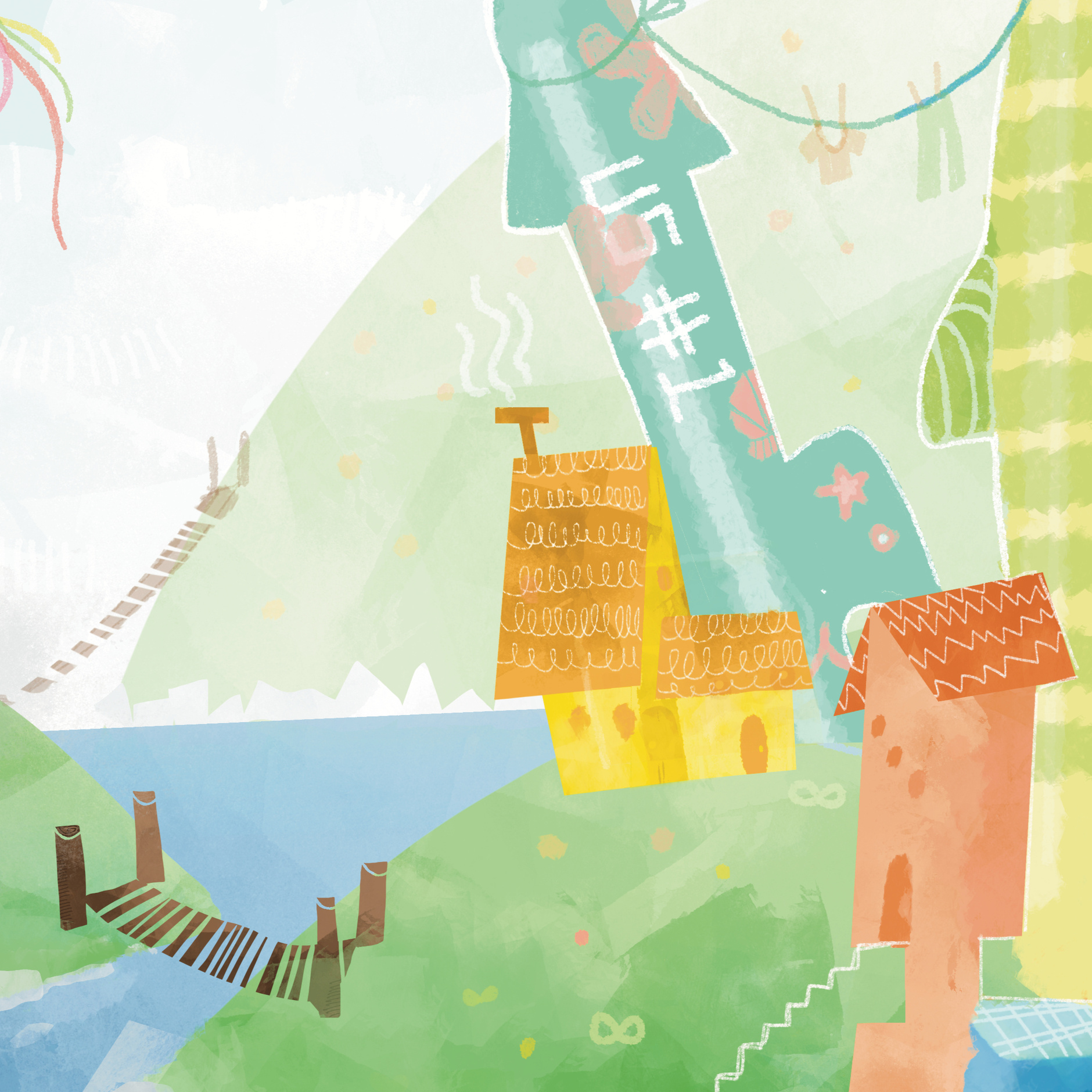
While illustrating for this concept, I was thinking of seaside towns in places like Iceland and Maine. I was thinking about how these large, inactive missiles standing out of the ground resemble lighthouses, and how if decorated and painted, could probably look a great deal like one.
The town is several little houses, connected to each other with bridges. They hang their clothes and kites off these inactive missiles. They paint them like they paint their houses, but with even more colorful shapes. They are so beyond inactive, birds are sleeping on them.
I was working a lot with texture and blocky shapes made with only a shape tool. After a bit of time, I played a lot more into this almost children's book-like feel.
Bellora is a conceptual cookie brand, inspired by real Austrian linzer cookie recipes and meant to be enjoyed with coffe or tea. Bellora's target demographic is the café lover, and it is mainly sold in single packs at local cafés.
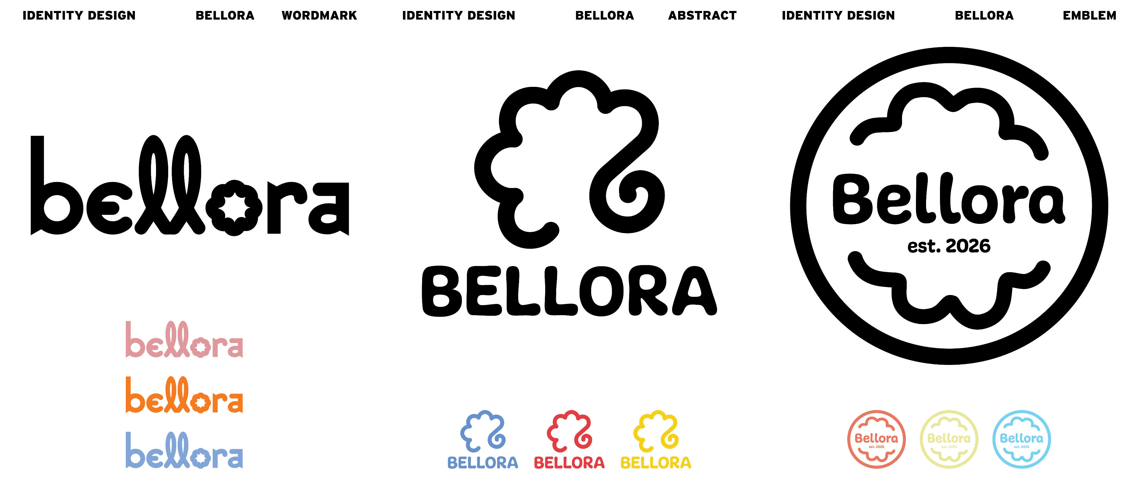
* Creating the Brand Identity
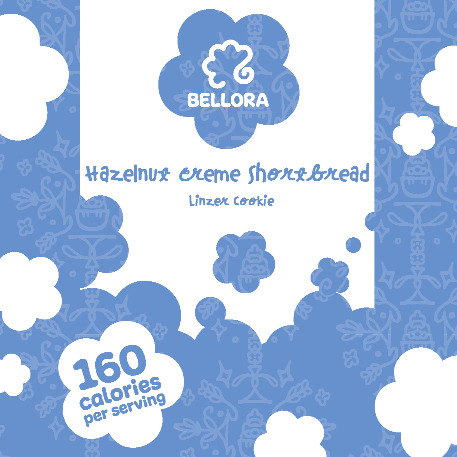
While creating the brand identity for the fictious Bellora, I kept three words in mind: "soft," "warm," and "traditional." Naturally, the center shape was always this beautiful scalloped circle, meant to be the shape of the cookie before the consumer even saw it out of its packaging. The typeface beneath, Freude, is perfectly playful and round.
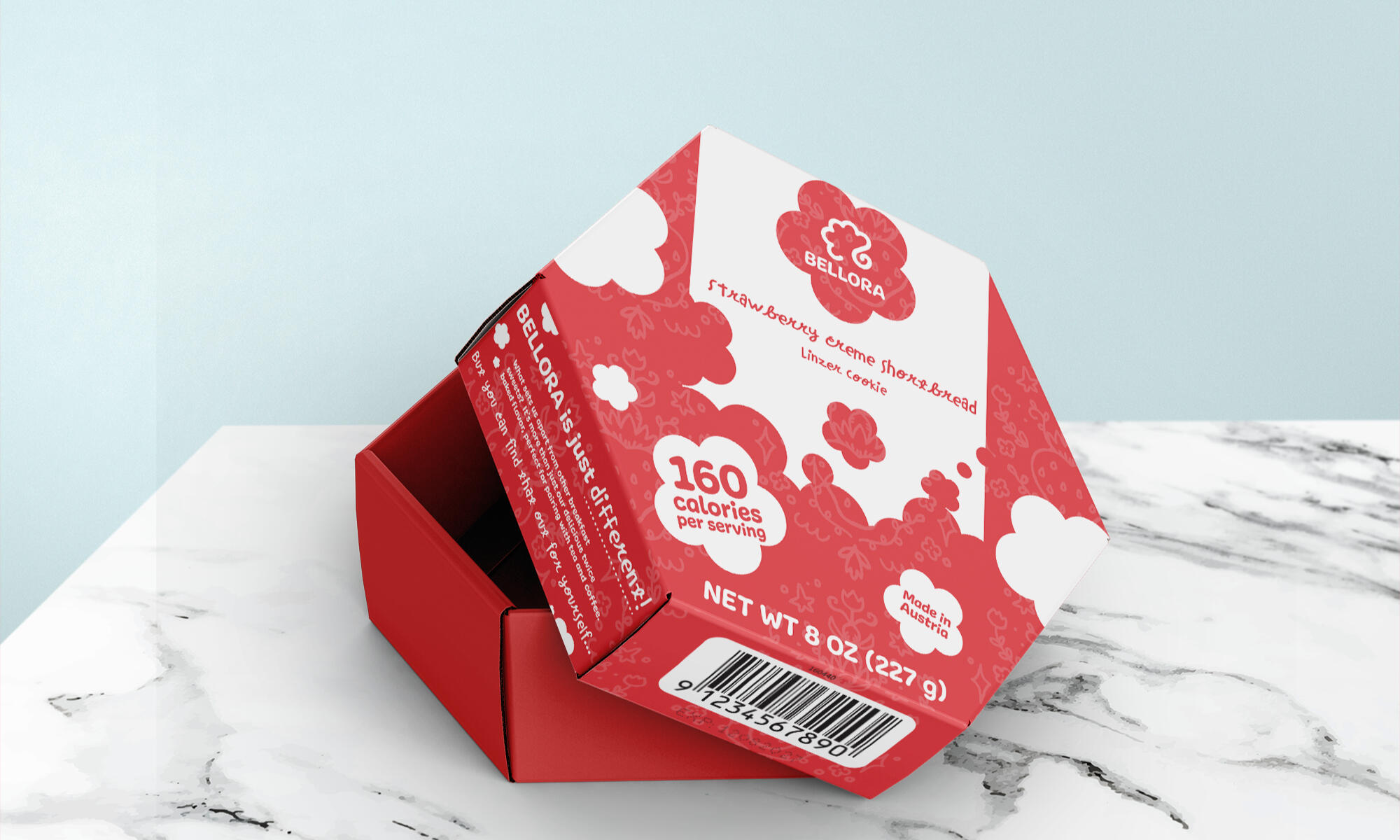
* The Packaging
While creating the packaging for Bellora, the most important element in my mind was its ability to reseal. The pack comes with two cookies, packaged on top of one another. I wanted to keep in mind the consumer who doesn't eat everything in one sitting. I wanted to create packaging that could easily fold back up and stayed unique!
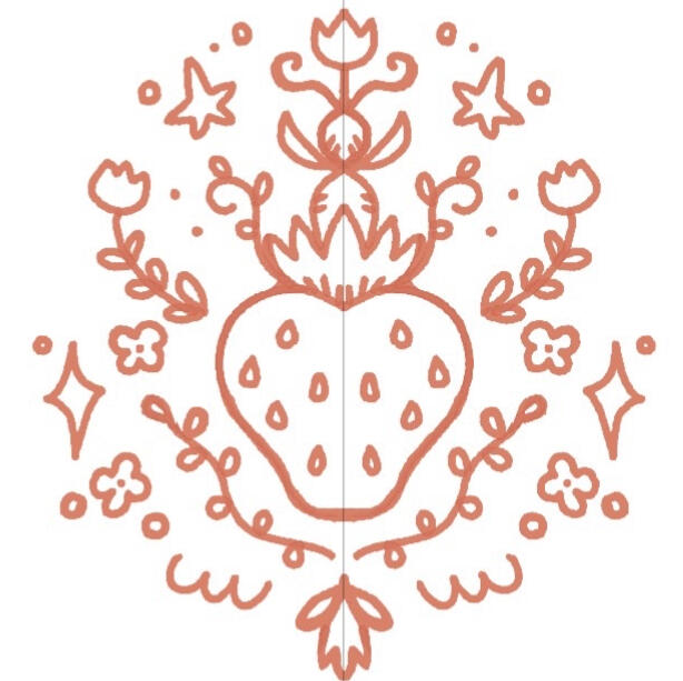
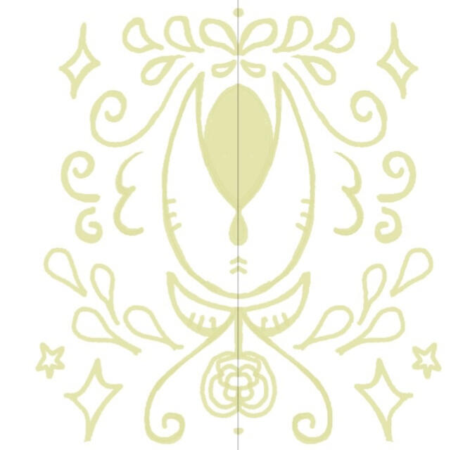
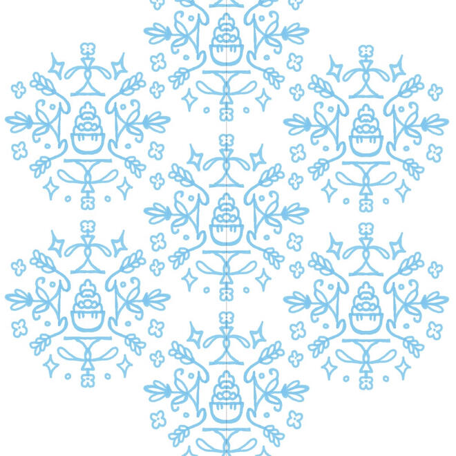
The background is all hand-illustrated patterning, featuring the main ingredient that separates all the different flavors apart. The red is strawberry creme, and the red correlates to a red berry. The pistachio creme is a light lime green, meant to resemble a green pistachio nut. Finally, the hazelnut creme flavor is a light blue instead of brown in order to look more appealing when they are all on a shelf together. The baby blue color is also a perfect contrast against the brown hazelnut creme in the cookie!Pictured below is the flavor illustrations.
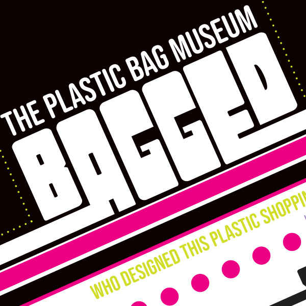
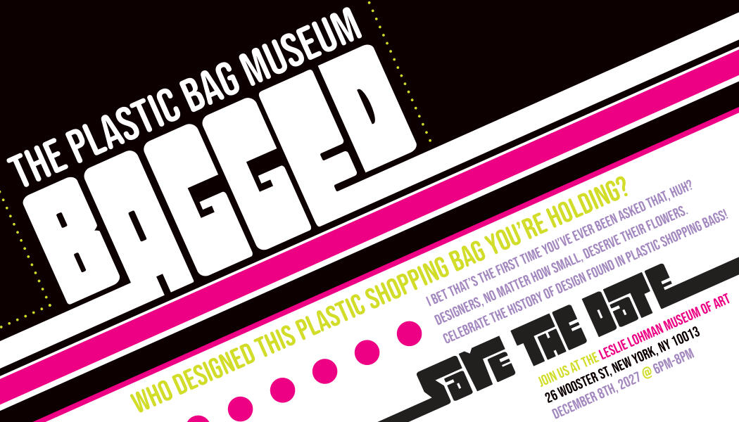
BAGGED: The Plastic Bag Museum is a fictitious branding project focused on bringing attention to the history of design followed through plastic shopping bags. In this project, I wanted to develop my Photoshop skills through editing and playing with layers by pushing elements in the photography forward and back. The pops of color are meant to replicate digital printmaking like riso, and the photos themselves are photoshopped to be more textured and real.
* Informational Pamphlet
The informational pamphlet is a piece that would be included in our guerilla advertising efforts. Our plans involved going into stores and replacing their plastic bags with our own environmentally friendly bags that had these pamphlets inside of them.
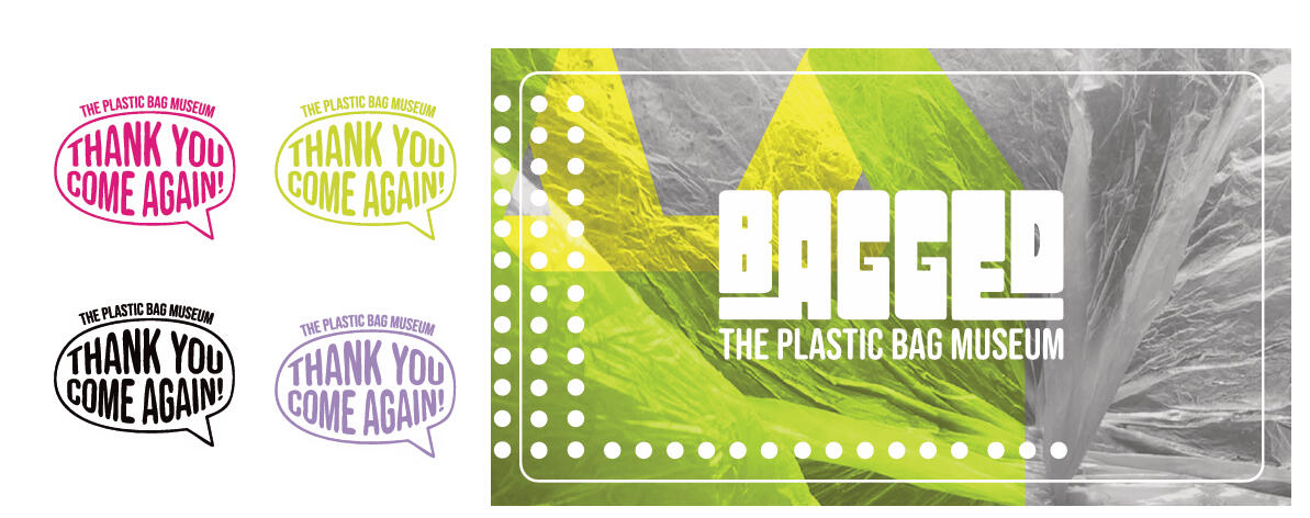
This pamphlet displays all of our brand colors, our type based logo, as well as all our information about the fictitious art gallery!
* Stickers and Bag
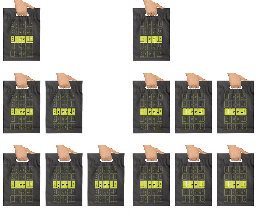
These stickers would also go into an advertised BAGGED bag. Each bag would include a "thank you, come again!" sticker in one of four colors, as well as a more traditional risograph printed sticker with our branded logo on it.Our bag would not be made out of typical plastic. As much as we love the design history behind the plastic bag, there is much to be said about its environmental impact! Our bag would be made out of a non-woven polypropylene, which is what the typical reusable grocery bag today is made of.It pays homage to the classic red inked white plastic "thank you" bags. Instead, it is our more alternative logo in bright yellowish-green and printed onto a black, reusable bag.
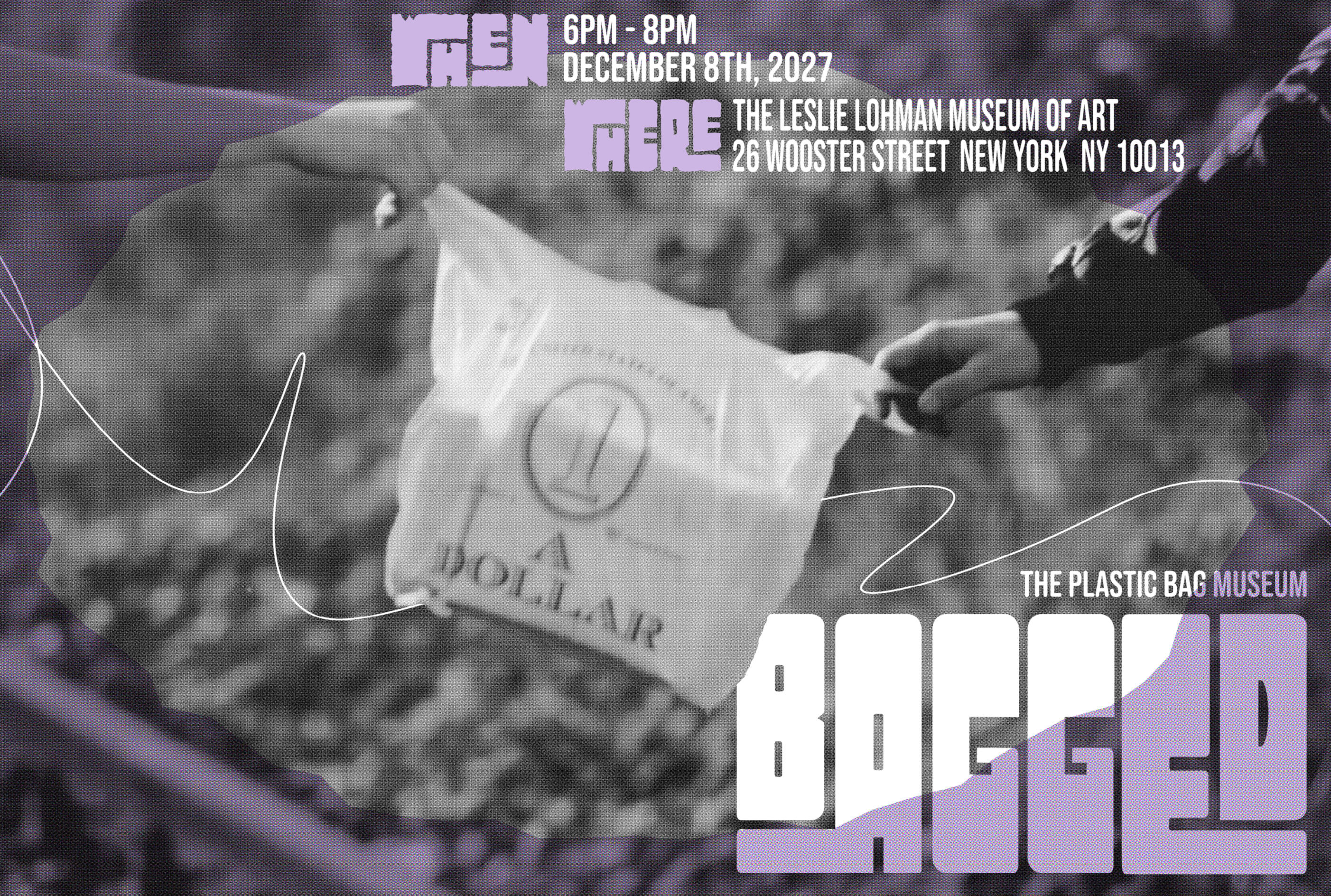
* Set of 3 Posters
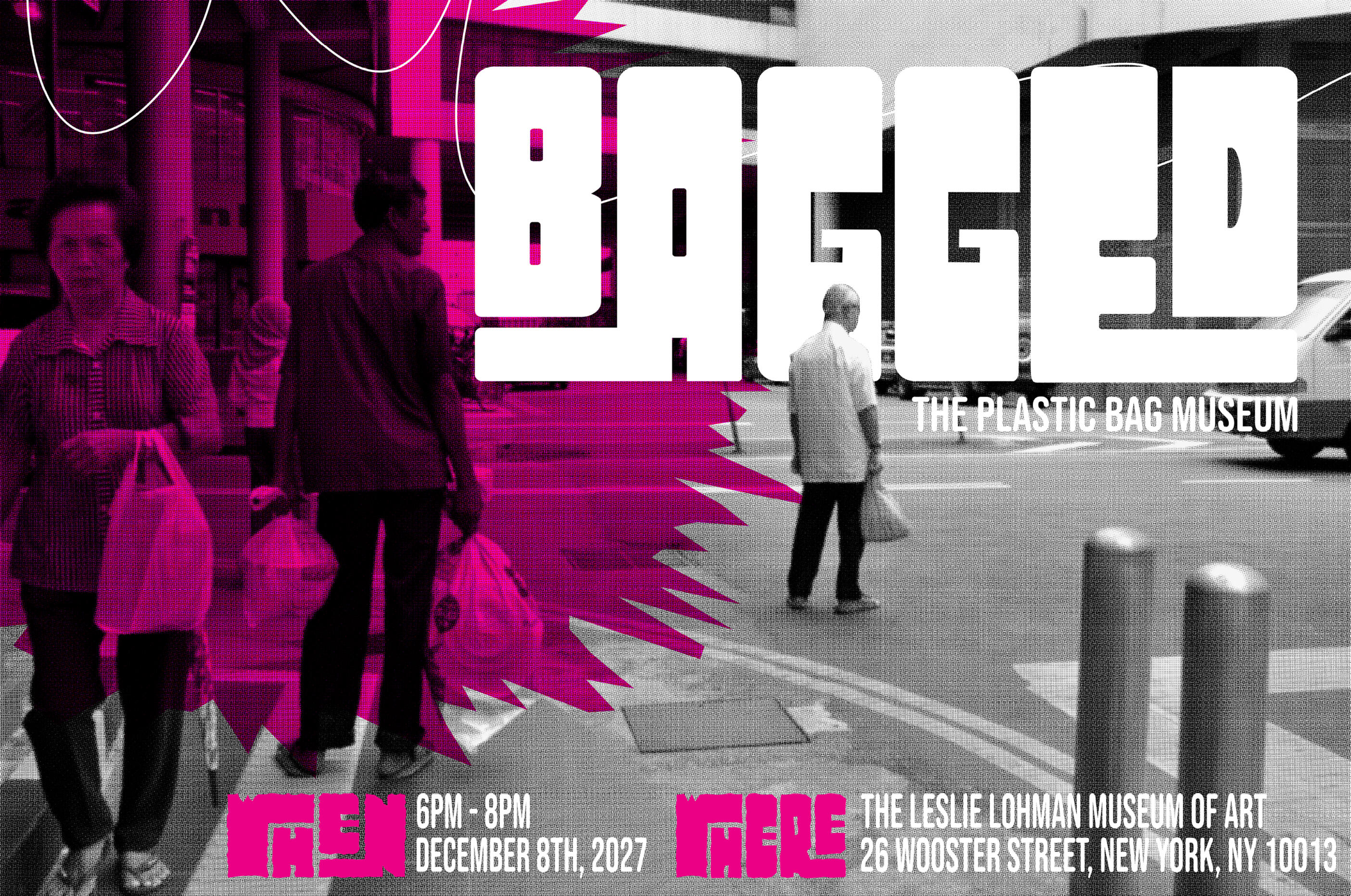
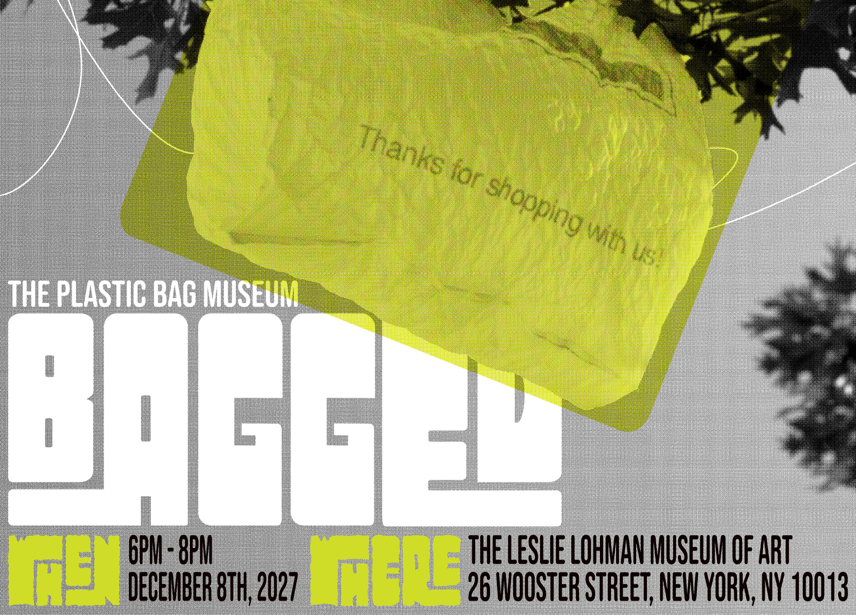
These posters were done with tons of Photoshop and Illustrator work! The photos are manipulated to be more textured with the black and white half tones. Then, certain elements are pushed back or pulled forward to create a background/foreground with the type and other graphic elements. Each poster displays one pop of color from the brand style guide.
Twice Loved Teddy is a fictitious teddy bear restoration company that focuses on repairing stuffed animals as a solution to excess toy waste in landfills. It's goals are to reduce waste and breathe life back into teddy bears that have been loved through generations.


* Twice Loved Teddy Style Guide
To begin this project, this fictitious brand needed some identity. I created the logo from sketches of cute teddy bears, and found his solemn expression to really tug on heartstrings. For the colors, I brought in warm, traditional browns and modernized them with bright pops of pink and red.
The type is more handwritten, almost like it is written with crayon or chalk. It brings back that nostalgic, childhood feeling.


* Twice Loved Teddy Packaging
For the packaging of this brand, I wanted to create multiple charming and repeating patterns. I wanted it to look like fabric that you can buy from the store by the yard. As if you could pull it and make a quilt from it! The box is meant to really stand out. Then, the bears are wrapped in the patterned tissue paper, which then gets a personalized TLT label!


* Twice Loved Teddy Website
(LINK) The Twice Loved Teddy website is rather simple, but gets the point across! It has these almost delicious looking layers, like a cake. The cute scalloped moments on the page help in making it look youthful and fun.
In this project, I focused on creating exciting, eye-catching typographic book covers for three very different pieces of writing. I learned so much from this project, and I love to look back on it as the moment where type design really "clicked" for me. Through this project, I learned how to match type faces with overall mood. Also, I learned about how composition works in typography.
* Crime and Punishment
For this cover, I wanted to push my understanding of colors and how "simple" shapes can create more complex compositions. I wanted to showcase my ability to create foregrounds and backgrounds with shapes. The skull, in red, almost just appears to be simple blood splatters. It really requires an extra second to look at and digest! I went even more into the blood splatter look by separating pieces of the skull into abstract pieces on the back panel.
* Developments in Dairy Cow Breeding: New Opportunities to Widen the Use of Straw
For this cover, everything but the type is entirely hand sewn by me. The cows are handsewn with felt, and I thrifted all the fabric and buttons. The other fabrics used on the page are all thrifted, then scanned. The type is meant to look like cross stitch patterns.
* A Death in the Family
This was the cover that made me fall in love with typography. For this cover, I wanted to explore both extreme compositions and color. I created this very dramatic composition with the dark grey completely overpowering the page. The white at the bottom acts as a point of visual interest, but also doubles as a sort of ground to the black sky.
There's tons of repeating patterns here with the coffin shape.
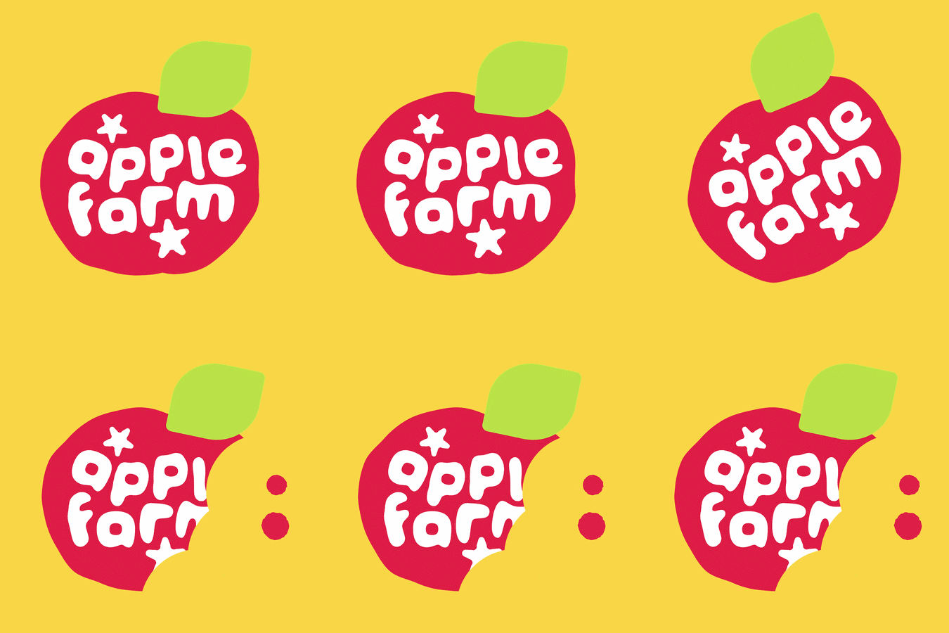
Apple Farm is a Youtube variety channel made up of several artists, graphic designers, writers, and other creatives. I played a massive part in the channel's art direction - from creating the introduction to creating the logo.
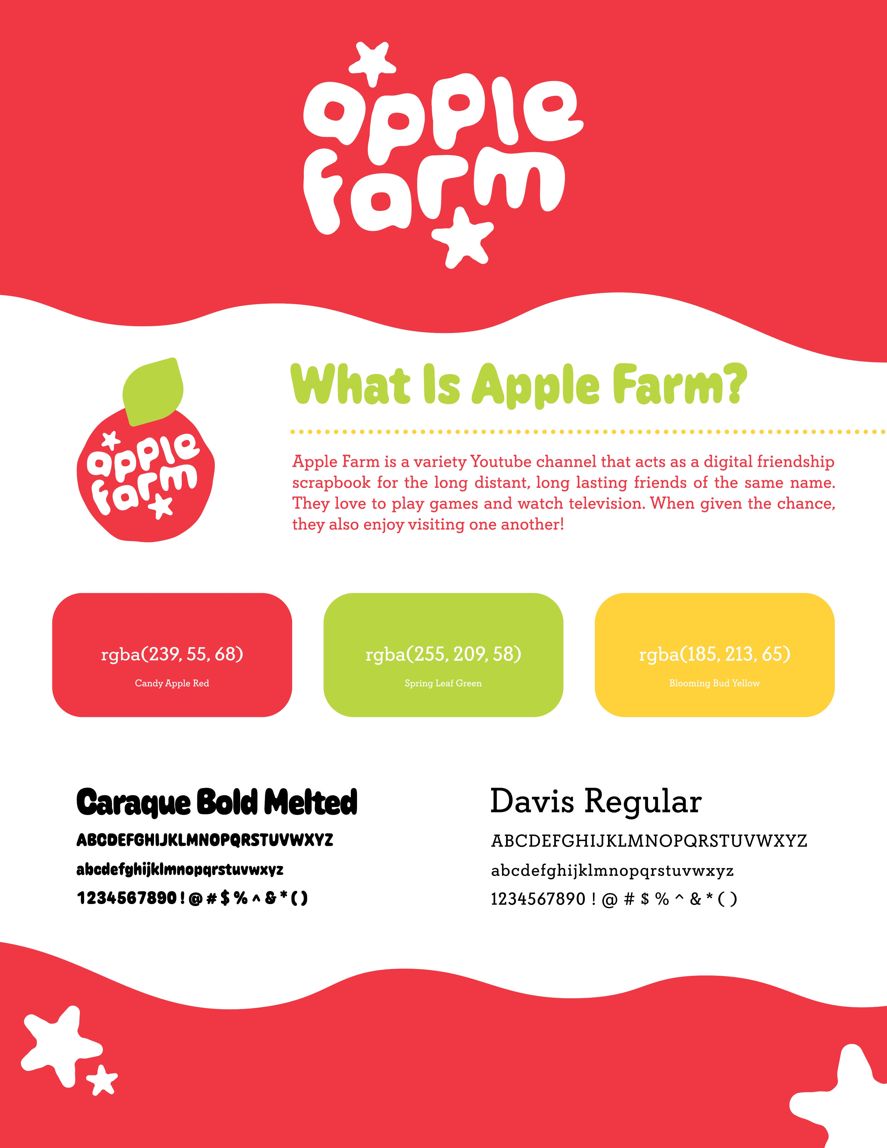
* Style Guide, Logo, Branding Identity
Apple Farm has a lot of members that enjoy "cute," bouncy design. I really wanted to reflect both the comedic style of the channel while also appealing to everyone's design senses. The logotype is cute, rounded, and chubby. The colors are bright, and are an homage to the three main colors of apples.
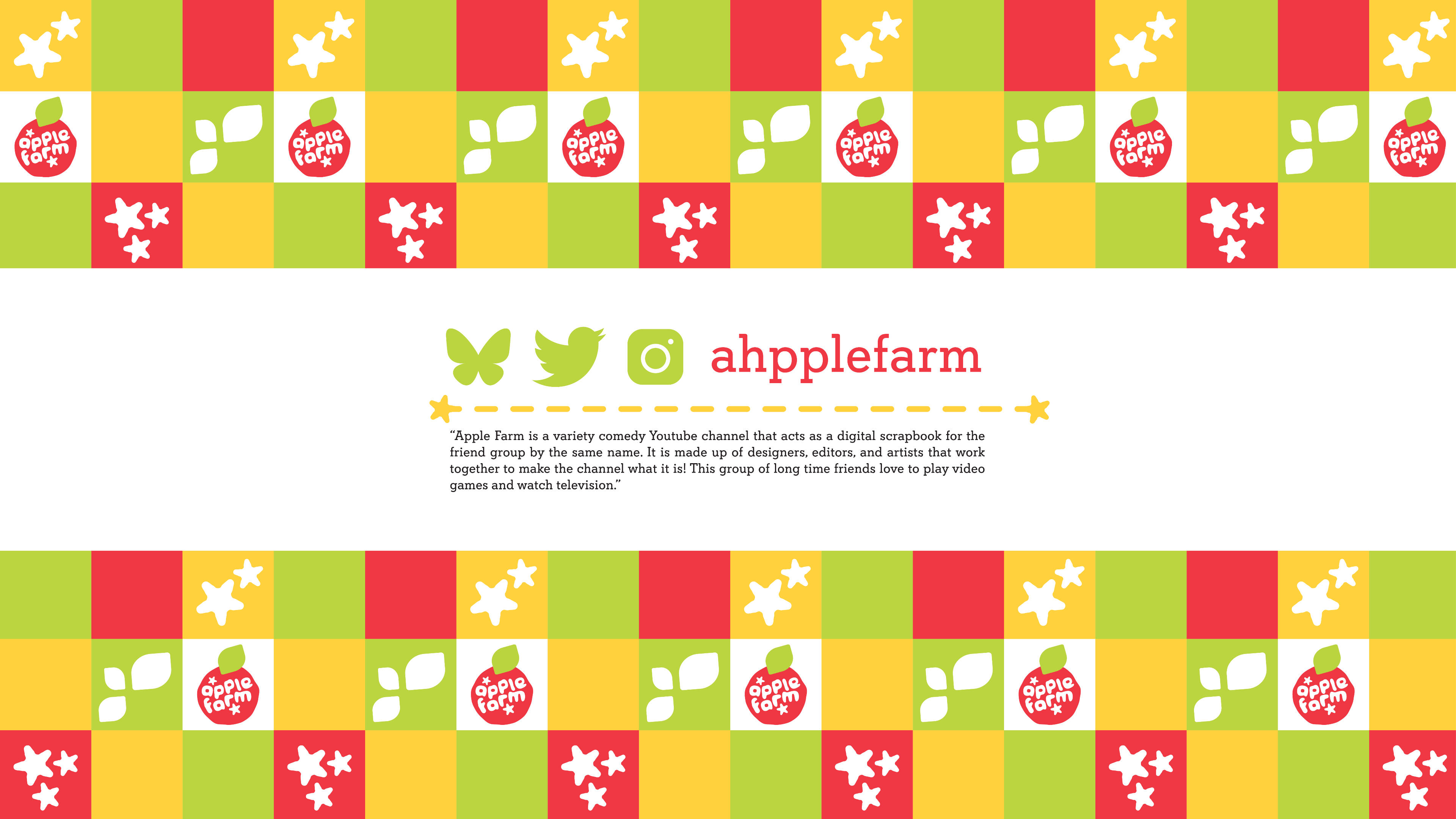
* Channel Banner
Creating the branding identity of a Youtube channel is a lot of hard work! Once you get the bare bones down, you have to create other smaller elements people rarely think of. For the banners online, I thought it would be best to have a small piece about the channel. It perfectly captures the focus of high quality design and fun.
* Introduction — Original
At the beginning of every video, this introduction will play. I brought all the Illustrator elements into Capcut, and animated them with keyframes. I added sound design, and it truly became the face of the channel.
* Outro — Original
At the end of every video, there is an outro. The song changes to a different song every video. In the blank gingham space, anything can go there! Usually, it is promotion for another video.


* Creating the Vlog Logo
The channel has two types of videos — vlog style content and gaming content. To distinguish the two, I created a "vlog" logo from real hand-sewn felt and scanned it in. I edited the colors to be more vibrant and made slight tweaks to the smaller elements like the stem and leaf.
Fusion is Kent State University's LGBTQ+ magazine. Founded in 2003, Fusion remains the region's only student magazine focusing on LGBTQ+ issues. I worked with Fusion from August 2023 to January 2026, illustrating and designing for both print articles and digital articles.


* The Dating App Dilemma by Alex Miller (Spring '25 Issue)
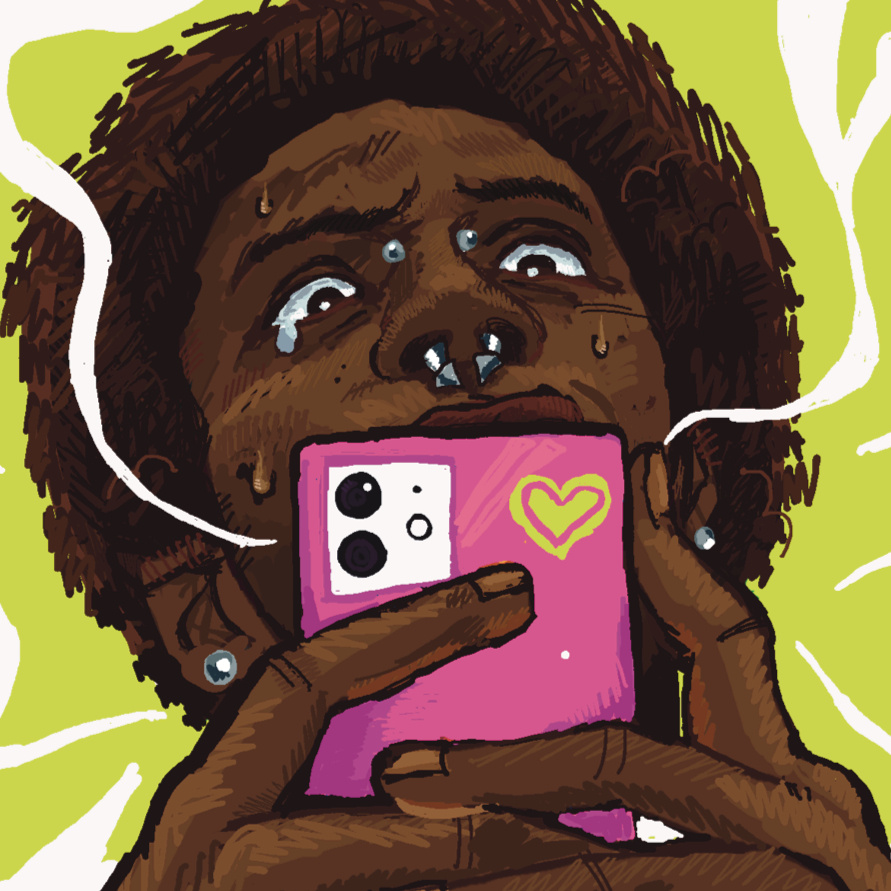
I was given the honor of illustrating Alex Miller's article “The Dating App Dilemma” in the Spring 2025 issue of Fusion Magazine. I was able to work within the style guide in regards to typography and color palette, but still was given tons of creative freedom on the exact illustration. I wanted to do this with an intense green/pink color palette from the style guide with ghost apps floating around the page to represent the disorienting reality of dating apps. The ghost patterns are very abstract and off the page.


* Bottoms Up! (Spring '24 Issue)
For this issue of Fusion, we included a few articles about recipes and food. For this, I approached it thinking of it as a sort of grungy cookbook. Featuring our brightest colors of our style guide, and really explosive, sharp graphics.-
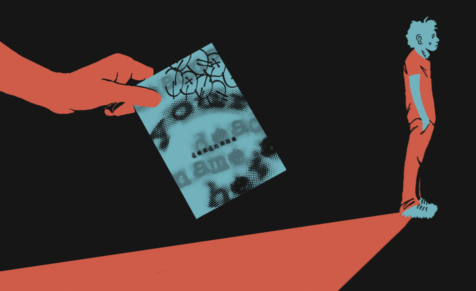
* How Kent State Recordkeeping is Putting Student Safety in Jeopardy (Online Article)
For this project, I needed to create a visual that was simple but heavy. In order to do this, I limited myself to only three colors. Then, I relied entirely on silhouettes until I added small details! The type on the letter was almost more important than the illustration itself. I made it super grungy and kind of off center in order to represent something darker.